Popppyn: Building a Faster, Conversion-Focused Shopify Experience for Fashion D2C Brands


About The Client
Popppyn
- IndustryFashion / Lifestyle eCommerce (D2C)
- RegionUSA
- PlatformShopify
- Delivery2 Months
Popppyn is a direct-to-consumer (D2C) fashion brand offering curated apparel collections. The brand operates on a model designed to support impulse-driven purchasing behavior and visually led merchandising campaigns.
It operates a digital retail system focused on continuous merchandising and customer engagement. The business manages a dynamic product catalog with frequent updates and category expansion needs. Efficient product organization and scalable browsing structure are critical operational requirements.
Additionally, it serves international customers across multiple devices and regions, requiring a storefront capable of supporting scalable catalog operations, stable user experience, and reliable transaction performance.
Project Overview
Shopify Storefront Built For Scale, Speed & Mobile Commerce
Popppyn required a Shopify eCommerce platform capable of supporting a large, continuously expanding product catalog. The platform also needed to accommodate mobile-heavy browsing behavior while maintaining consistent storefront performance during peak traffic periods.
The existing shopping journey lacked structural clarity and required improved navigation logic, better interaction efficiency, and stronger consistency across devices. This need was driven by the brand’s ongoing catalog expansion and growing customer base.
The client engaged Digisoft Solution to optimize Shopify storefront architecture and frontend performance. The work focused on improving storefront speed and rendering stability. The implementation focused on streamlining product discovery, restructuring collections, and improving mobile browsing performance across key storefront flows. The redesigned storefront improved browsing speed, checkout flow efficiency, and cross-device consistency.
The Concept
Visual-Led D2C Commerce With Minimal Navigation Depth
The platform was designed around a direct-to-consumer shopping model where purchasing decisions are driven by visual clarity, fast product access, and reduced navigation depth.
The experience strategy prioritized fast product visibility and a simplified category structure, enabling users to move from discovery to purchase with minimal steps. A mobile-first approach guided navigation, filtering, and cart placement to reduce browsing layers and improve product access speed.
The interface structure emphasized clean hierarchy, consistent spacing, and structured category grouping. This enables faster movement between collections, product pages, cart, and checkout.
Navigation depth was reduced by simplifying category hierarchy and streamlining product-to-collection transitions. Across mobile devices, the system emphasized faster product entry, fewer intermediate screens, and a more direct path to cart and checkout actions.
Key Challenges Addressed
Fashion Catalog Scale Met With Structured Mobile Commerce
Handling Media-Heavy Fashion Catalogs
The storefront contained large volumes of product imagery, promotional banners, and collection visuals that increased asset payload size and delayed visual rendering on collection pages. Maintaining smooth page interaction and optimized loading performance while displaying visually intensive content was a major implementation challenge.
Reducing Excessive User Actions During Purchase Flow
The existing shopping journey required a simplified and deterministic user flow between product browsing, variant selection, cart updates, and checkout. Product pages needed to present purchasing information clearly without introducing unnecessary interaction steps or visual clutter.
Maintaining Structured Catalog Organization
Frequent product additions and collection expansion created the need for a scalable catalog structure capable of supporting organized product grouping, simplified menu hierarchy, and intuitive browsing pathways without increasing interface complexity.
Supporting Consistent Rendering Across Devices
The platform needed to maintain stable layout behavior across varying screen sizes, resolutions, and device orientations. Interactive storefront components, product grids, media sections, and navigation elements required consistent alignment and spacing throughout the browsing experience.
Technical Solutions We Implemented
Performance & Catalog Architecture For Conversion-Focused Commerce
Shopify collection structure, frontend asset optimization, and dynamic variant synchronization were combined to improve browsing speed, checkout efficiency, and cross-device consistency.
Shopify Collection and Menu Configuration
Custom Shopify collection structure and navigation menus were configured to improve product grouping, reduce browsing depth, and simplify storefront navigation.
Frontend Asset Optimization and Rendering Control
Storefront assets were optimized using Shopify CDN, responsive image delivery (srcset), lazy loading, and deferred/conditional JavaScript loading. These changes improved Core Web Vitals by reducing render-blocking resources and improving visual stability (CLS) and loading performance (LCP).
Dynamic Product State Synchronization
Product variant changes were handled using Shopify variant objects with JavaScript-driven state updates. This dynamically refreshes price, availability, product media, and cart state without full page reloads.
Checkout and Inventory Integration
The storefront was integrated with Shopify’s native checkout, cart synchronization, inventory tracking, and order management systems to maintain transactional consistency throughout the purchase lifecycle. Product metadata, URL structure, and collection indexing were optimized. to simplify catalog management in the Shopify admin.
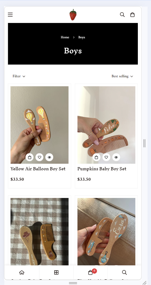
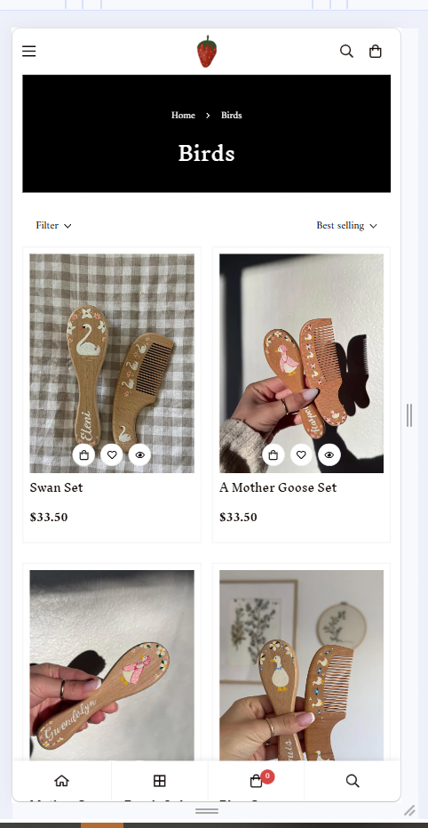
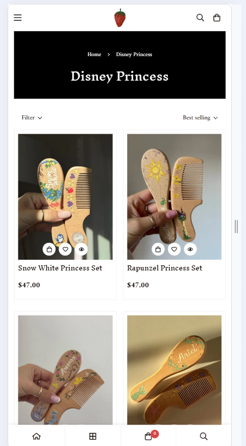
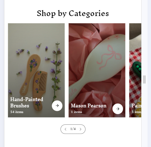
Screens From the Live Build
Surfaces We Designed & Engineered Into Production
Selected moments from the Popppyn Shopify storefront—homepage merchandising, collection browsing, variant selection, cart interaction, and mobile checkout flows.


Core Features & Functionalities
Designed For Conversion-Focused Fashion Commerce
- Conversion Homepage Merchandising: The homepage featured collection-driven merchandising sections, promotional banners, featured arrivals, and direct category access to reduce user journey friction.
- Mobile-Optimized Responsive Storefront: The storefront delivers a consistent browsing and purchasing experience across mobile, tablet, and desktop devices using responsive Shopify theme layouts and device-responsive interface components.
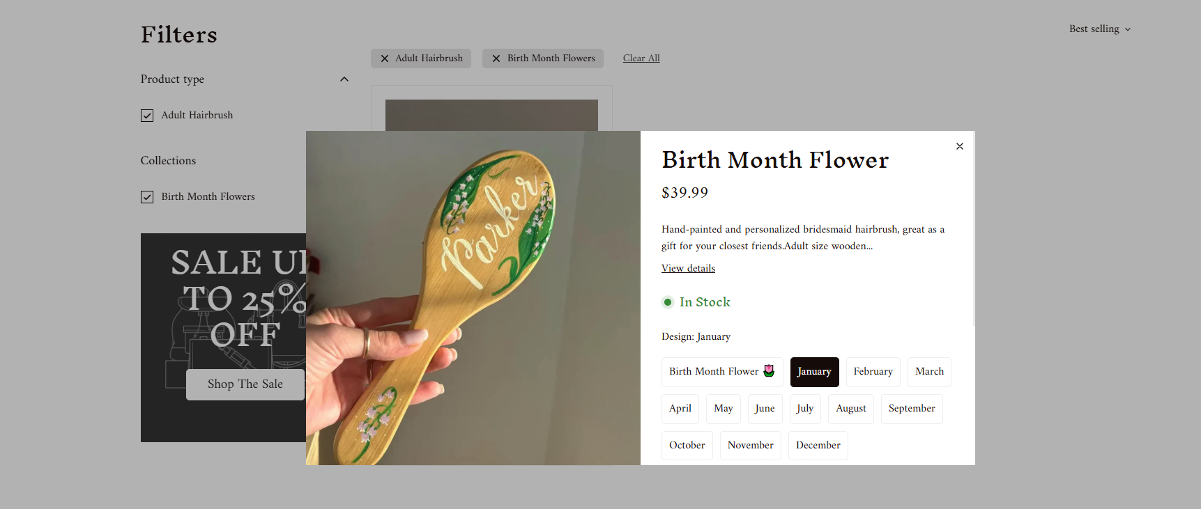
- Variant-Based Product Configuration: Product pages support selectable options such as size, color, and style variations depending on the product category, allowing customers to configure products directly before cart submission.
- Optimized Cart Interaction Flow: Cart interaction behavior was streamlined to reduce interruptions during quantity updates, cart editing, and checkout progression across mobile devices.
- Structured Store Architecture for SEO: The storefront architecture included structured product URLs, collection hierarchies, metadata management, and internal linking patterns.
Tech Stack We Used
Tools Chosen For Shopify OS 2.0 & Frontend Performance
Frontend Layer
Shopify Core Layer
Commerce & Checkout Layer
Performance & Delivery Layer
Analytics & Tracking Layer
Hosting & Infrastructure
Testing & Quality Assurance
Validated For Performance, Variants & Checkout
Cross-device responsive rendering, variant synchronization, end-to-end cart and checkout testing, and Lighthouse audits under constrained mobile network conditions.
- Tested responsive rendering across mobile, tablet, laptop, and desktop devices to ensure layout stability and consistent component alignment.
- Evaluated Shopify product variant synchronization for accurate pricing, availability, media updates, and cart interactions.
- Performed end-to-end cart and checkout testing to confirm uninterrupted transaction flow and order processing.
- Audited responsive media delivery, lazy loading, and deferred asset behavior to improve frontend performance.
- Conducted cross-browser testing across Chrome, Safari, Firefox, and Edge to verify consistent rendering and functionality.
- Performed Lighthouse audits and mobile network simulation testing to evaluate frontend performance under constrained device and bandwidth conditions.
Our Development Approach & Timeline
Phased Delivery Across 2 Months
From requirement analysis and store planning through theme development, product configuration, performance optimization, testing, and post-launch monitoring.
Requirement Analysis & Store Planning
Commerce goals, catalog structure, and mobile performance baseline.
Shopify Theme Setup & Frontend Development
OS 2.0 templates, responsive layouts, and merchandising sections.
Product Configuration & Store Integration
Collection structure, variant logic, and cart synchronization.
Responsive & Frontend Performance Optimization
CDN assets, lazy loading, deferred scripts, and Core Web Vitals tuning.
Testing, Validation & Store Refinement
Cross-browser QA, variant validation, and checkout flow verification.
Final QA, Deployment & Post-Launch Monitoring
Production launch, analytics review, and performance monitoring.
Measurable Outcomes
Faster Mobile Commerce With Higher Engagement & Conversion
Performance metrics were evaluated using comparative data from Shopify Analytics, storefront interaction tracking, mobile performance testing, and cart behavior analysis across equivalent pre- and post-implementation periods. The analysis focused on storefront speed, browsing engagement, cart progression, and checkout performance after deployment.
Mobile LCP down from 4.9s across key storefront pages
Product page engagement increase through scroll depth, variant interactions, and add-to-cart events
Cart abandonment down from 72% following checkout flow simplification
Average session duration up from 1m 48s across mobile and desktop traffic
Digisoft Solution redesigned and optimized the Popppyn Shopify experience to improve mobile usability, simplify catalog navigation, and support faster customer purchasing behavior across devices. The implementation focused on scalable collection architecture, responsive frontend performance, structured product configuration, and streamlined cart interaction to support long-term eCommerce growth and operational flexibility.
