Every Believer A Healer: Building a Scalable Shopify Experience for a Faith-Based Learning Platform


About The Client
Every Believer A Healer
- IndustryFaith-Based Wellness / Spiritual Healing Platform
- RegionUSA
- PlatformShopify
- Delivery2 Months
Every Believer A Healer is a Shopify-based, faith-oriented digital learning platform focused on delivering structured educational and self-development content through guided digital content. The platform offers coaching programs, downloadable resources, digital guides, and learning materials designed to support user engagement and progressive learning journeys.
With a content-driven approach, the platform emphasizes organized access to educational resources, simplified program discovery, and seamless interaction across devices to help users engage more effectively with its platform content.
Project Overview
Faith-Based Learning Rebuilt With Clear Architecture & Navigation
The existing Shopify storefront lacked a clearly defined content hierarchy. Educational resources, coaching programs, and digital products overlapped within shared navigation and page structures. This made it difficult for users to quickly identify relevant resources and move between content and offerings, particularly on mobile devices.
As the platform expanded, the current storefront architecture began limiting content discoverability and creating navigation friction. The client approached Digisoft Solution to reorganize the platform architecture and improve usability. The scope focused on streamlining architecture, navigation pathways, and cross-device interaction flow.
The restructuring increased accessibility to programs, educational resources, and digital offerings while reducing navigation friction across devices.
The Concept
Distinct Content Pathways For Guided Learning Journeys
The platform structure was redesigned to clearly separate educational content, digital resources, and program-focused conversion sections. The storefront was organized into distinct content pathways based on user intent and browsing behavior, instead of grouping all information within shared layouts.
The updated system enables smoother transitions between learning materials, coaching programs, and digital offerings. This approach improved content discoverability while creating a more guided and consistent browsing experience across devices.
The storefront architecture was redesigned using modular Shopify sections and standardized Liquid templates for clearer content organization and scalable page management.

Key Challenges Addressed
Buried Programs & Broken Navigation Met With Structured Shopify Architecture
Content Structure Confusion
Storytelling, educational resources, and program sections were combined within shared layouts. Users struggled to distinguish informational content from enrollment-focused sections and program-related content.
Low Content Readability
Long-form content lacked proper hierarchy, spacing, and responsive formatting. This reduced readability across devices and made important information harder for users to scan and consume quickly.
Poor Program Differentiation
Multiple digital programs used inconsistent layouts and content structures. Users struggled to differentiate program objectives, outcomes, and learning pathways across offerings.
Complex Navigation Flow
Overlapping menu structures and excessive navigation depth increased navigation complexity. Users found it difficult to efficiently locate educational resources, program pages, and important storefront sections.
Unstructured User Journey
Content sections lacked logical progression and guided flow. This limited smooth transitions from educational material toward program exploration and enrollment-focused actions.
Structure & Access Confusion in Shopify
Inconsistent Shopify page structures created content management challenges. Unclear post-purchase workflows also caused confusion around digital content delivery, account access, and resource availability after purchase.
Technical Solutions We Implemented
Shopify OS 2.0 Architecture For Discoverability & Digital Fulfillment
Collections, modular sections, standardized Liquid templates, and automated digital delivery were combined to improve navigation clarity, content readability, and post-purchase access across devices.
Shopify Information Architecture
Collections, navigation structures, and page templates were reorganized using Shopify Online Store 2.0 capabilities, including JSON templates, modular sections, and app blocks. This created a clearer separation between educational content, programs, and digital resources across the storefront.
Modular Section Framework
Reusable Shopify sections with configurable Shopify sections with schema blocks were developed to support scalable content management and consistent layouts.
Liquid Template Standardization
Custom Liquid templates and reusable snippets standardized program and resource page structures. This improved content consistency and simplified long-term maintenance across multiple digital offerings.
Responsive Navigation Optimization
Mobile navigation and responsive layouts were optimized using breakpoint-based CSS, improved touch targets, simplified menu hierarchy, and stable header behavior.
Structured Page Sequencing
Page sections were reorganized to create a clear progression from educational content to trust elements and conversion-focused CTAs. This improved guided user flow and conversion clarity.
Digital Fulfillment Automation
Shopify digital delivery workflows were configured to automate post-purchase access to downloadable resources and program materials.
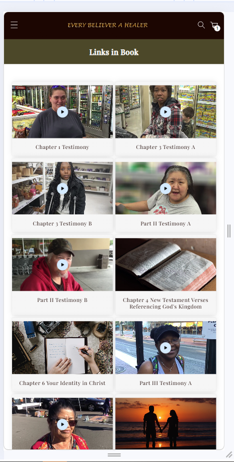
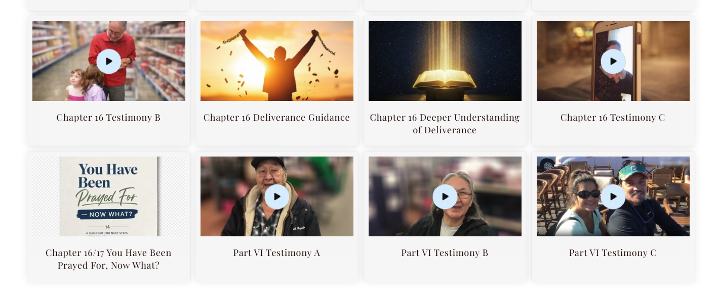
Screens From the Live Build
Surfaces We Designed & Engineered Into Production
Selected moments from the Every Believer A Healer Shopify storefront—homepage storytelling, program pages, educational resources, digital delivery flows, and mobile navigation.


Core Features & Functionalities
Designed For Faith-Based Digital Learning & Conversion
- Structured Storytelling Homepage: The homepage was organized into clearly defined sections for educational messaging, program highlights, testimonials, and conversion-focused actions.
- Dedicated Program Detail Pages: Each offering includes an independent page with a consistent layout, clearly defined objectives, and an organized presentation of program scope, outcomes, and access details.
- Automated Digital Delivery System: Purchased digital products are delivered instantly through integrated digital delivery workflows. This ensures immediate and seamless access without manual processing requirements.
- Secure Checkout Integration: Shopify’s native checkout system ensured PCI-compliant, secure payment processing with encrypted transactions, stable session handling, and reliable digital product order flow across devices. This reduces payment friction and improves transactional reliability.
- Simplified Navigation Experience: A streamlined navigation architecture prioritized essential pathways, reducing cognitive load through minimal menu hierarchy, optimizing information architecture, and guiding user flows. This improved content discoverability and accelerated browsing efficiency.
- Structured Content Layouts: Content is organized using a clear typographic and sectional hierarchy, improving readability, scan efficiency, and system consumption of long-form information across pages.
Tech Stack We Used
Tools Chosen For Shopify OS 2.0 & Content Architecture
Frontend Technologies
Shopify Features & Integrations
Performance Optimization
Analytics & Tracking
Testing & Quality Assurance
Validated For Navigation, Performance & Checkout
Cross-device responsive testing, navigation path validation, browser compatibility checks, frontend performance evaluation, and Lighthouse audits across key storefront pages.
- We tested responsive layouts across desktop, tablet, and mobile screens to maintain proper content structure, readable formatting, and functional navigation on different screen sizes.
- Reviewed Shopify navigation paths, internal linking, and menu behavior to ensure uninterrupted access to educational resources, programs, and storefront sections.
- Browser compatibility was validated across Chrome, Safari, Firefox, and Edge to identify rendering issues, alignment problems, and inconsistent component behavior.
- Evaluated frontend performance by checking image optimization, asset loading, script execution, and media rendering to assess overall page responsiveness.
- Tested product pages, cart workflows, checkout routing, and form submissions to confirm accurate user interactions and reliable transaction handling.
- Conducted regression testing after layout and content updates to ensure existing functionality and usability remained unaffected.
- Executed Lighthouse performance audits to assess Core Web Vitals, mobile responsiveness, and frontend loading behavior across key storefront pages.
Our Development Approach & Timeline
Phased Delivery Across 2 Months
From requirement analysis and information architecture planning through theme development, mobile optimization, QA validation, and post-launch optimization.
Requirement Analysis & Existing Store Assessment
Content hierarchy audit, navigation friction mapping, and mobile performance baseline.
Information Architecture & Navigation Planning
Collection structure, menu hierarchy, and content pathway design.
Shopify Theme Development & Interface Structuring
OS 2.0 templates, modular sections, and standardized Liquid layouts.
Mobile Optimization & Frontend Enhancements
Responsive navigation, touch targets, and breakpoint-based layout refinement.
Performance Testing, Functional Validation & QA
Cross-browser QA, checkout validation, and Lighthouse performance audits.
Final Refinements, Deployment & Post-Launch Optimization
Production launch, analytics review, and engagement monitoring.
Measurable Outcomes
Clearer Navigation With Higher Engagement & Conversion
The improvements were evaluated using storefront performance tracking, mobile usability testing, navigation analysis, and post-deployment engagement monitoring. We also compared the platform’s condition before and after optimization.
Mobile LCP improved from 5.8s after optimizing images, scripts, and frontend loading behavior
Homepage bounce rate decreased from 68% through improved content organization and simplified navigation layout
Checkout completion rate increased from 52% following streamlined cart interaction and improved storefront usability
Responsive rendering consistency improved from 63% after resolving layout alignment and breakpoint-related issues
The final implementation improved accessibility, navigation clarity, and mobile usability across the storefront. Users could navigate programs, educational resources, and digital offerings more seamlessly through a more organized and performance-focused storefront experience.