Table of Content
Digital Transform with Us
Please feel free to share your thoughts and we can discuss it over a cup of coffee.
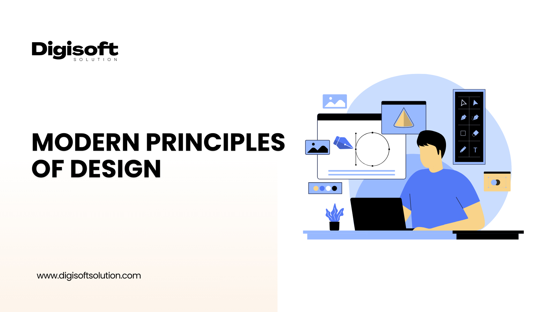
Visual communication is always changing, so knowing the basics of design is important to make good-looking and useful graphics. Whether it's a logo, website, brochure, or social media post, UI UX design principles help create clear, balanced, and well-organized work.
So, how many design principles are there? Some say five, others say seven (like the well-known 7 principles of design), and some even mention twelve or more. But no matter the number, most of these lists focus on the same basic rules that help designers create visuals that not only look good but also clearly share the right message.
The blog talks about important design principles that both beginners and professionals should know. It explains why each principle matters and how they help in creating visuals that are clear, effective, and easy to remember.
What are the Principles of Design?
These are the rules, instructions, or guidelines that assist the designer in using the elements of design-color, line, shape, space, and so on-for effective design. These provide the necessary structure for any layout to be visually balanced, clear, and interesting.
Though there would be many numbers of such principles depending on who one consults, many coalesce with one another on the principle of about 12 related core principles. These are principles that a designer could use to better his or her journey to a wonderful visual experience through different types, especially towards principles of Software design and principles of graphic design.
1. Contrast
It has the clear difference between two things like light and dark colors, thick and thin lines, or different font styles like serif and sans-serif. In UI UX design, it ensures text visibility over background images, and this is one key principle of good web design.
- Importance: High contrast increases accessibility and directs users' attention where it matters.
- Tip: Use contrast judiciously to direct users' attention and set up a visual hierarchy.
2. Balance
It is how visual weight is distributed in a composition, and it can come in two types:
2.1 Symmetrical balance: Balance is achieved with equal weight distribution on either side.
2.2 Asymmetrical balance: balance is achieved with uneven weight distribution, yet it feels visually in harmony.
- Importance: Balanced designs feel stable and professional. In terms of digital interfaces, it is prerequisite and fundamental in maintaining a coherent layout.
3. Emphasis
It is all about the creation of stand-out importance that special information holds in a design. Think of it like the headline of an article or a call-to-action button on a landing page. Size, color, or placement often helps in skirting into the use of the emphasis.
This is one of the most potent features under the principles of graphic design, making sure that the focus of the viewers gets drawn quickly.
- Here is a tip for you: Keep only one or two elements in emphasis at a time for a design. Otherwise, the audience may feel too cluttered.
4. Proportion
Proportion denotes the relative size and scale of the various aspects of the design. It shows importance; a large image or heading, for instance, would draw attention more than the small units.
In talking about elements of design and the principles playing their part, proportion is a means to balance and harmonize the layout in its entirety.
- Why it matters: The right use of proportion would signal importance and give harmony. It is one of the fundamental elements and principles of design in responsive layouts.
5. Hierarchy
Much like emphasis and proportion, hierarchy involves ordering elements permutation in a space to indicate where an item lies in its order of importance. Users must know where to look first, second, and so on.
In the principles of good web design, hierarchies could serve the purpose of letting users navigate their content.
- Tips: Use font sizes, bolds, spaces, and even placement to build a clear hierarchy.
6. Repetition
It creates a sense of cohesion and consistency between various elements of a design. Repeated application of certain design elements consisting of color, type, and shape consolidates brand identity and ties in the overall composition.
In the theory of web design, repetition aids in the quick recognition of navigational elements, contributing to an intuitive experience.
- Tip: Repetition helps keep the brand consistent across platforms.
7. Rhythm
You could consider rhythm as the music that makes a design flow. It is established by spacing and repeating elements as beats do in music. The following different types of visual rhythm:
- Regular: Repeated at even intervals
- Random: Irregular spacing
- Flowing: Curved and natural
- Progressive: Gradual change in size, attitude, shape, or color.
Implementing a strong rhythm can indeed carry users through a web page, something that is important within the principles of web design for site user retention and engagement.
8. Variety
Adding variety makes the visual an interesting experience for users. Variety can include colors, shapes, pictures, or fonts. However, an overabundance of variety may create chaos without any unifying strategy.
- Hint: Use an element of variety to avoid monotony, but ensure that things still feel cohesive, an axiomatic principle in elements and principles of design.
9. White Space
This area of a layout is left for the design, meaning that there is an empty space void of any content. White space permits elements to breathe, increases readability, and focuses on key areas.
It is perhaps the best example of principles of unity in design. While a clean layout is usually finished with plenty of white space, it is often more perceived as being modern and user friendly.
- TIP: Do not fear empty space, it is the greatest tool of all design.
10. Pattern
The term "Pattern" refers merely to the repetition of elements in a prescribed manner. Patterns are used to add texture and interest to designs without overwhelming the viewer.
Patterns are great when used in background or branding elements, adding an extra layer of complexity to the bigger, clean picture.
- Note: Use patterns sparingly to enhance elements without detracting from them.
11. Movement
Movement causes the eye to flow with the design. This may be achieved through element placement, flow or directionality.
Why it matters: Strategic movement directs the user to critical messages or functions like a signup form or a purchase button.
12. Unity
Most importantly, unity brings everything together. Every part of a design is integrated into a composition of harmony. Unity creates wholeness, professionalism, and clearness.
From minimalistic landing pages to highly detailed brochures, principles of design unity should be applied in all projects of aesthetically pleasing and functional designs.
- Tip: Unity is most often accomplished with regard to color, typography, spacing, and layout.
Other Principles of Design
Other design principles not widely recognized but equally important include typography, color, Gestalt Principles, grids, alignment, framing, shape, scale, and transparency. Each affects the visual communication design in specific ways.
- Typography is the style and appearance of text that includes the selection and arrangement of typeface/font, size, letter-spacing (tracking), line-spacing (leading), and space between words (word spacing) to promote readability while providing any desired aesthetic qualities. The consideration of typography conveys information and emotion to the viewer.
- The use of color within a design has a great deal of power in creating mood and atmosphere, and conveying messages while fostering an emotional response and creating separation of elements within the work.
- The Gestalt Principles focus on humans' tendency to see things as a unified whole despite their complex arrangements. Recognition of patterns, symmetry, and closure will strongly inform viewers' perception of any given visual element as a collective whole.
- Objects are organized using a grid and alignment in order to promote a clean and functional layout. They also serve to group common elements in a design which works towards better aesthetics.
- Framing draws attention to certain elements of the design by directing the viewer's focus, much like a spotlight that illuminates the critical focal points.
- Shape dictates perception and, in many ways, can symbolize particular messages or emotions.
- Scale refers to size in relation to its use; it affects importance and focus. Scale can be manipulated to attract attention and show the order of importance.
- Transparency gives depth by allowing the overlapping of elements, leading to the richness of visual expression while avoiding visual havoc in the organization of the composition.
When these principles are used well together, they add purpose and style to the design, making it clearer and more visually appealing. Hire a UI UX Designer to bring these principles to life in your next project.
Importance of Design Principles
Design is not just for the sake of beautification. It entails visual storytelling, user experiences, and communication. Design principles help designers:
- Maintain visual consistency
- Guide the viewer's attention
- Achieve accessibility and usability
- Generate hierarchies and emphasize information
- Incorporate the overall user experience
If you don't understand these principles well, even a beautifully designed layout might not work properly or could confuse the viewer. Whether creating a website or branding a business, your design blueprint is constructed by the basic elements and principles of design.
Conclusion
Realizing this fact and putting into practice the principles of design is non-negotiable in design work. Contrast and hierarchy, unity with rhythm, every design principle adds value to beauty and functionality at the same time in any design.
If your interest is in improving the digital brand presence, creating beautiful websites or just knowing how to design strategically, these principles will serve as the proper initial step for application. At Digisoft Solution, we fused businesses with the full power of designs that are applied to web and graphic projects with full accuracy and creativity. Let us work together in turning design principles into business success.
Let Digisoft Solution today bring your ideas to reality with strong, professional designs.
Digital Transform with Us
Please feel free to share your thoughts and we can discuss it over a cup of coffee.
 Kapil Sharma

 Parampreet Singh


